
You are laying out a thumbnail in Photoshop, the same composition in a Figma frame, and a lower third in Premiere. You want the same twelve columns across all three so the logo sits in the same place every time. Each app has its own idea of a grid, none of those ideas can be exported, and so you end up setting it up three times and hoping they match.
The fix is boring and it works: make the grid once as a transparent image, and drop it in as a layer. Same pixels, same positions, every app that can place an image. Here is how to get one that actually lines up, and the three settings that are responsible for nearly every grid that does not.
- Set the canvas size before anything else. A mismatch there is why grids do not line up.
- Force Square Cells takes the columns control away from you and works it out from your rows.
- PNG downloads a file. SVG and CSS copy to your clipboard instead.
- Transparent grid and transparent background are two separate buttons, and you probably want the second one.
- In After Effects, make it a Guide Layer and it can never render by accident.
Why the app's own grid is not enough
Every one of these apps can draw a grid, and every one of them keeps it to itself.
Figma's layout grids are genuinely good, and they are the right answer while you are inside Figma. They are a property of a frame. They do not come with you to Photoshop.
Photoshop's grid lives in preferences, measured in whatever unit you last used, and it is a view setting rather than something in the document. Two people opening the same PSD see different grids. Guides are per document and can be saved, but drawing twelve evenly spaced guides by hand is exactly the job you were trying to avoid.
Premiere and After Effects give you title and action safe overlays and essentially nothing else. There is no arbitrary grid in either of them.
So the grid has to become an asset. Once it is an image, it is the same object everywhere, and it is versionable, shareable and reviewable like any other file.
Set the canvas size first
This is the step that decides whether any of the rest works, and it is the one people skip.
The overlay is generated at exactly the width and height in the dimension boxes. If those say 800 by 600 and your document is 1920 by 1080, the image gets scaled when you place it, and a grid that was mathematically exact becomes a grid whose lines sit slightly off everywhere. It looks nearly right, which is worse than looking wrong, because you will trust it.
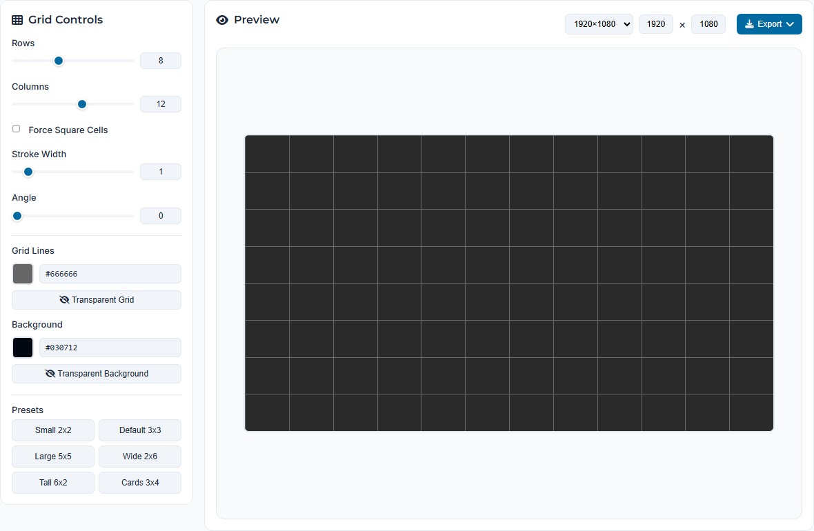
There are four presets, and they are the four sizes this comes up for: 1920×1080, 1080×1080, 1200×630 and 800×600. That covers a video frame, a square social post, a link preview card and a small mock. Anything else, type it into the two boxes and the preset flips to Custom on its own.
Rows, columns, and the square cell trap
Rows and columns do what you expect. The sliders stop at a sensible range; the number box next to each will take considerably more if you are building something fine, up to 500.
Force Square Cells is the one that confuses people, and the confusion is worth explaining because the behaviour is correct and just unexplained. Tick it and the columns control greys out. That is not a bug. With square cells on, the column count is no longer yours to set: it is calculated from your row count and the shape of the canvas, because those two things already determine how many square cells fit across.
Three rows on an 800 by 600 canvas gives you cells 200 tall, so four of them fit across an 800 wide canvas, and the tool sets columns to four and disables the control. Change the canvas and the column count moves again. If you want to choose both numbers yourself, untick it and accept that your cells will be rectangles on a non-square canvas.
Set stroke width to 1 rather than leaving it at 0.5. A half pixel line is fine in the SVG, but when a PNG is rasterised at 1x it lands across two pixel columns and renders as a soft grey smear. At 2x and above the half pixel is fine again.
PNG, SVG or CSS
Three export buttons, and they do not all do the same kind of thing, which trips people up.
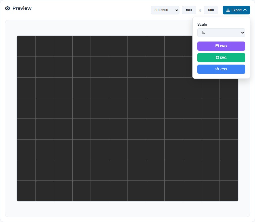
PNG downloads a file. It is rasterised at your canvas size multiplied by the scale, so 1920×1080 at 2x is a 3840×2160 file. Use 2x if the overlay will ever be viewed above 100 percent, which in Photoshop it always will be. The filename carries the grid and the scale, along the lines of grid-8x12-2x-1756...png, so a folder of them stays readable.
SVG copies to your clipboard. It does not download. If you click it and nothing appears in your downloads folder, nothing has gone wrong. Paste it into an empty text file and save that as .svg, or paste directly into Figma, which will turn clipboard SVG into real vector layers. That second route is the useful one: you get the grid as editable lines rather than as a picture of lines.
CSS copies to your clipboard too, and it is not a background image trick. You get a real CSS Grid rule, a .grid-container with grid-template-rows and grid-template-columns set to your row and column counts, your stroke as the gap and padding, and a .grid-item rule carrying the border. It is a starting point for a layout rather than a decoration, which is a more useful thing for it to be.
The transparent background step people miss
There are two transparency buttons and they are not the same one.
Transparent Grid makes the lines invisible and leaves the background. That sounds useless, and mostly is, until you want a plain coloured card at an exact size.
Transparent Background is the one you almost certainly want. It drops the fill and leaves only the lines, so the PNG can sit over your artwork instead of hiding it. The preview switches to a chequerboard when it is on, which is your confirmation before you export.
If your exported PNG arrives with a solid dark rectangle behind it, this is the button you missed. The default background is a near black, so it is not subtle when it happens.
Rotating the grid
The angle control rotates the whole grid as one piece. Diagonal grids are worth more than they look for layouts that need movement in them, and for checking that a composition still balances when it is not sitting on horizontals.
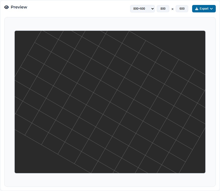
Rotate a grid and it stops covering the canvas, because a rectangle turned inside another rectangle leaves the corners bare. This is what the Fill Space checkbox is for, and it is also why you will not find that checkbox until you move the angle off zero: with no rotation there is nothing for it to fix, so it stays hidden.
Tick it and the grid is generated larger, based on the diagonal of the canvas rather than its width, then clipped back to the canvas edge. You get lines to the corners and a clean rectangular export. On a ten by ten grid at 30 degrees that is the difference between eight lines and twelve.
Getting it into each app
Once it is a transparent PNG, this part is short.
- Figma. Paste the SVG straight in and you get vector lines you can recolour and nudge. If you would rather it stayed inert, drop the PNG in as an image fill on a frame instead, and lock the layer.
- Photoshop. File, Place Embedded, then lock the layer so you stop selecting it by accident. Set the layer opacity to about 30 percent. A grid at full strength competes with the work.
- Premiere Pro. Import the PNG, put it on a video track above everything, and switch that track's output off before you export. There is no safety net here, so if you have ever shipped a video with a grid burned into it, you know why the next one matters.
- After Effects. Import it, drop it at the top of the layer stack, then right click the layer and choose Guide Layer. It stays visible in the comp and the render queue ignores it entirely. This is the only one of the four where you cannot forget to turn it off.
What it will not do
It will not make a true isometric grid. The angle control is a single rotation of the whole grid, and isometric needs two axes at roughly 30 degrees running against each other. At 45 degrees you get a diamond lattice, which is close enough for some jobs and not for others. Exporting two rotated grids and stacking them gets you nearer.
It will not give you uneven columns. Every cell is the same width as every other cell. A layout grid with a wide centre column and narrow rails is a Figma layout grid job, not this.
It will not do gutters as a separate concept. Stroke width is the line, and the space either side of it is whatever the division leaves. If you need a 12 column grid with 24px gutters exactly, the CSS export gets you closer than the image does, because there the gap is a real number you can edit.
And it runs entirely in the page. Nothing is uploaded, which for a grid generator is less of a privacy point than it is for the file tools and more a simple statement about why it is fast.
Make one
Set the canvas to your real document size, pick your rows, and take the PNG at 2x. It takes about thirty seconds and you only have to do it once.
Open Grid MakerFrequently asked questions
Why does the columns control grey out?
Because Force Square Cells is ticked. With it on, the number of columns is worked out from your rows and the canvas shape rather than set by you, so the control is disabled to show it is no longer yours to move. Three rows on an 800 by 600 canvas gives you four columns. Untick it and the control comes back.
Why did nothing download when I clicked SVG?
SVG and CSS copy to your clipboard rather than downloading a file. Only PNG produces a download. If you want an .svg file, click SVG and then paste into a new empty text file and save it with an .svg extension.
My exported PNG has a solid background instead of a transparent one.
The background colour is still set. There is a Transparent Background button directly under the background swatch, and it is a separate control from the Transparent Grid button above it. Press the background one, check the preview shows a chequerboard, then export again.
The grid does not line up with my layout.
Almost always a canvas size mismatch. The overlay is generated at the width and height in the dimension boxes, so if that is 800 by 600 and your document is 1920 by 1080, dropping it in scales it and every line lands between where you wanted it. Set the canvas to your real document size before exporting rather than resizing the image afterwards.
How do I stop the grid rendering in my final video?
In After Effects, right click the layer and set it as a Guide Layer. It stays visible while you work and is ignored by the render queue, so you cannot forget to turn it off. Premiere has no equivalent, so there you switch off the track output before you export.
Can I make an isometric grid?
Not properly. The angle control rotates the whole grid as one piece, so you can get a diamond lattice out of it at 45 degrees, but a true isometric grid needs two axes at about 30 degrees each and this only has one rotation. Export two rotated grids and stack them if you need something close.