

If you tried to paste your Tailwind v4 colours into Figma and the picker rejected them, you found the real problem before reading a word of this. Tailwind moved its palette to OKLCH in v4. Figma variables store sRGB. The values have to be converted somewhere, and doing it by hand across eleven steps and five scales is 55 conversions you will have to redo the next time the brand colour changes.
There are three routes that actually work. Which one you want depends on whether you need the stock Tailwind palette, a plugin that reads your own CSS, or a generated scale from a brand colour you already have.
What changed in Tailwind v4
Two changes matter for this.
First, tailwind.config.js is no longer read by default. Colours are declared in CSS inside a @theme block:
@import "tailwindcss";

@theme {
  --color-brand-50:  oklch(0.97 0.02 250);
  --color-brand-500: oklch(0.62 0.19 250);
  --color-brand-900: oklch(0.32 0.09 250);
}
That gives you bg-brand-500, text-brand-900 and the rest, generated from the custom property names.
Second, the default palette is expressed in OKLCH rather than hex. OKLCH describes a colour by lightness, chroma, and hue in a way that matches how eyes work, so stepping lightness evenly produces steps that look evenly spaced. In HSL they do not, which is why hand built palettes so often have one step in the middle that feels wrong.
The practical consequence is that Tailwind's palette now covers colours that sRGB cannot represent, on displays that can show them. Converting those to sRGB for Figma clips them slightly. For most brand colours the difference is invisible. For very saturated greens and cyans it is noticeable, and worth knowing before someone asks why the Figma swatch looks duller than the browser.
Route 1: you want the stock Tailwind palette
If you are using Tailwind's own colours rather than a custom brand scale, do not convert anything. Someone has already published the whole palette as a Figma file.
Search the Figma Community for the Tailwind v4 colours file, duplicate it into your drafts, then publish it as a library from your team. Every scale arrives as variables with the right names.
The catch is versioning. Tailwind's palette has changed between releases, including new scales added after the initial v4 launch. A community file is a snapshot of whenever its author last updated it. Check the file's update date against your Tailwind version before you build a design system on top of it.
Route 2: you have custom colours in CSS already
If your @theme block is the source of truth and you want Figma to follow it, use a plugin that parses CSS.
Several exist in the Figma Community. Look for one that explicitly states OKLCH support, because the older Tailwind importers were written for v3 and expect hex. A plugin that silently fails on oklch() will either skip those variables or import them as black, and you will not notice until you are three screens into a design.
Things worth checking before you commit to one:
- Does it handle
color-mix()and nestedvar()references, or only literal values? Most real theme files use at least one of these. - Does it create variables or paint styles? Variables support modes, which is what you need for dark mode. Styles do not.
- Does re-running it update existing variables in place, or create duplicates? The second behaviour turns every palette update into manual cleanup.
- Does it preserve your collection structure, or flatten everything into one collection?
Run any candidate on a throwaway file first with your real theme block. Five minutes of testing beats discovering the limitation after you have wired it into a library.
Route 3: you have a brand colour and need the scale built
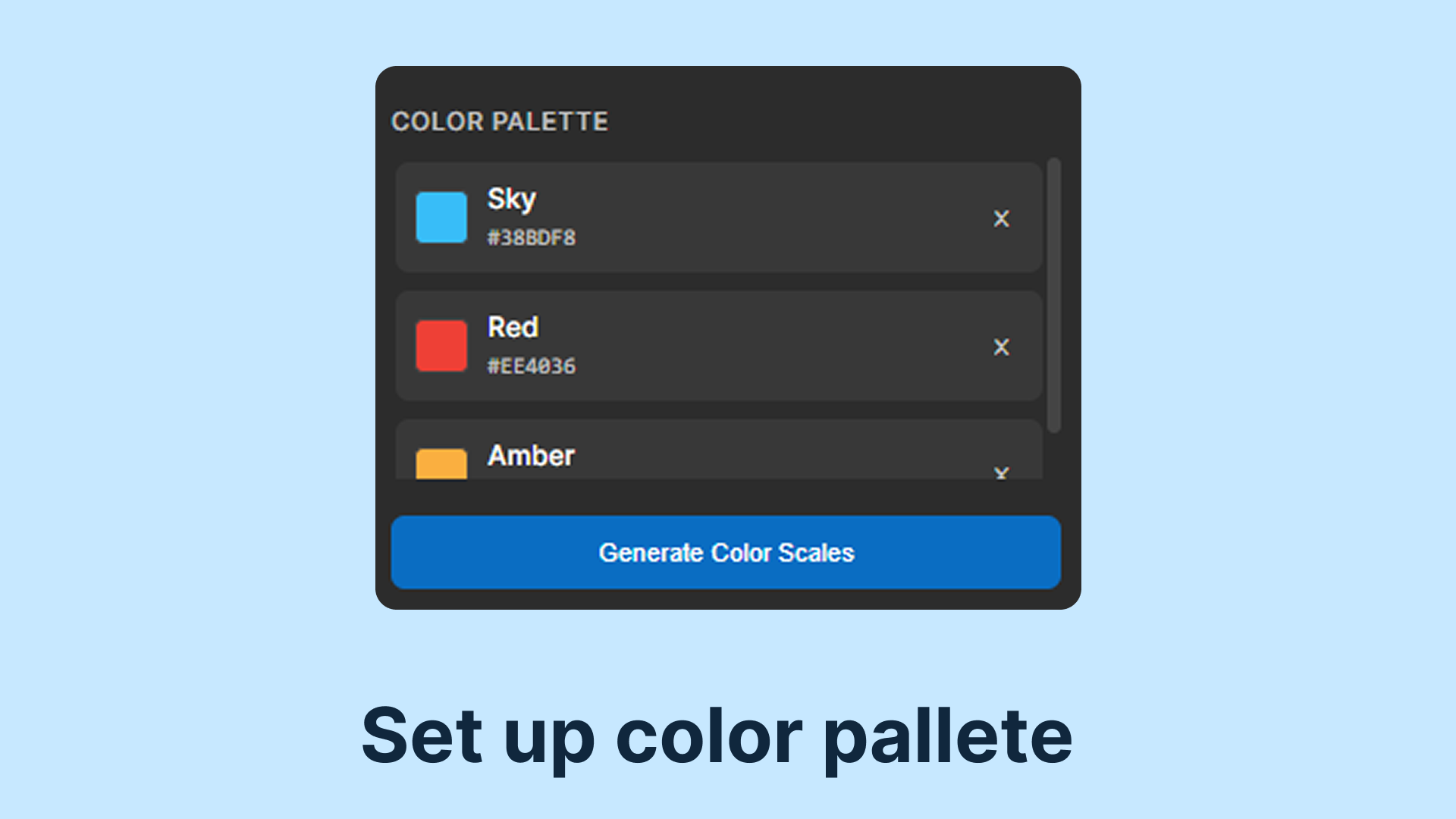
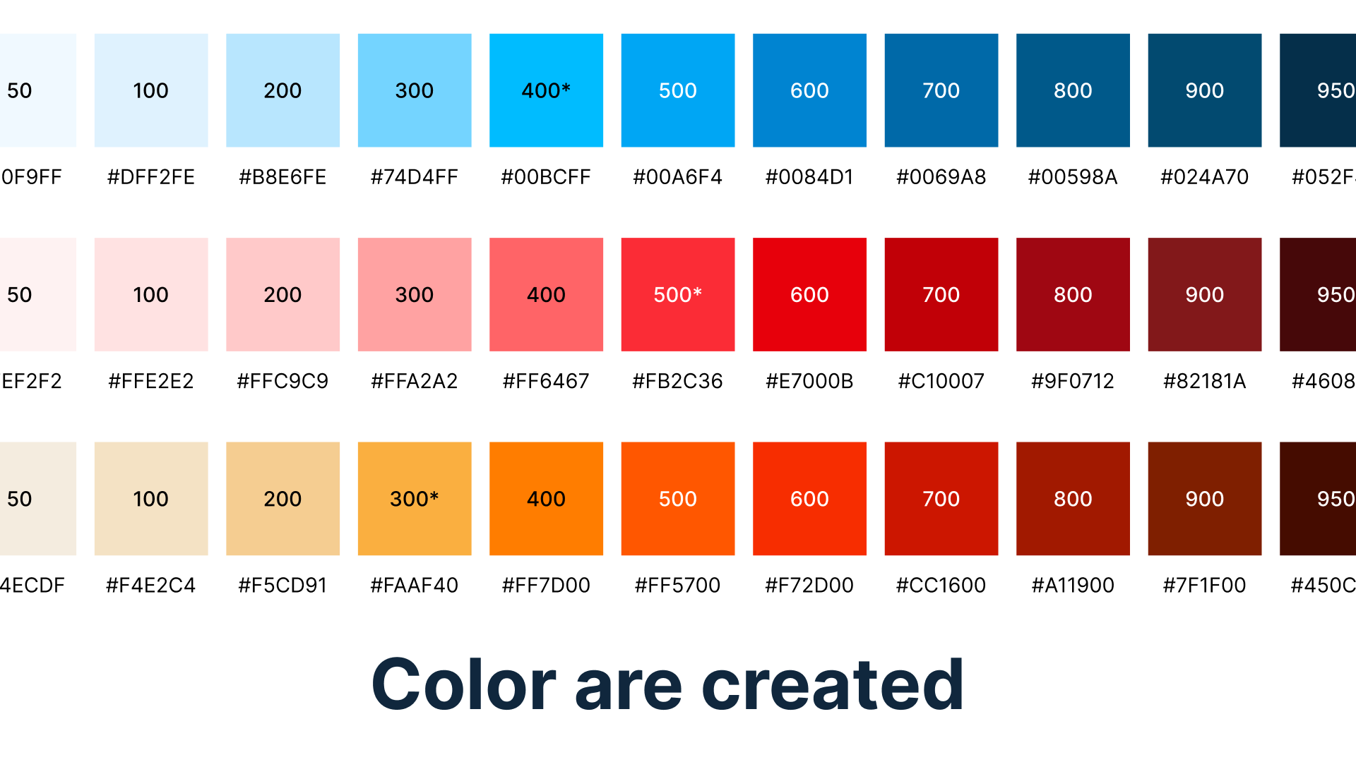
This is the common case: marketing hands you one hex value and you need eleven steps that look Tailwind native. TailWinks generates the full v4 scale in OKLCH from any colour you paste in, then exports it straight to Figma variables. Free, runs in the browser.
Open TailWinksAnchor your brand colour at the right step
One decision causes more trouble than any tooling choice, and it happens before you generate anything.
Most people take the brand colour, call it 500, and build outward. That works when the brand colour happens to sit near the middle of the lightness range. When it does not, half the scale collapses. A pale mint anchored at 500 leaves 50, 100 and 200 nearly identical, and someone will eventually ask why brand-100 and brand-200 look the same.
Convert the brand colour to OKLCH first and read the L value, then place it where it actually belongs:
| Lightness (L) | Anchor at |
|---|---|
| Above 0.80 | Step 200 or 300 |
| 0.55 to 0.80 | Step 400 or 500 |
| 0.40 to 0.55 | Step 600 or 700 |
| Below 0.40 | Step 800 or higher |
The other thing worth getting right is chroma. Holding it constant across all eleven steps makes the light end wash out to grey and the dark end go muddy. Tailwind's own palette curves it: low at both extremes, peaking around 500 to 600. Any generator worth using does this for you, but it is the first thing to check if a generated scale looks synthetic.
Neutrals are the exception. A grey scale wants a very small constant chroma, under about 0.02, biased toward your primary hue. That faint tint is what makes greys feel like part of the palette instead of a browser default.
Structure the variables so theming stays cheap
However you get the colours in, the collection structure decides how much work a theme change costs later.
Use two collections. The first holds primitives: every raw swatch, named by scale and step, such as blue/500. No modes on this collection, because these values do not change between light and dark.
The second holds semantic tokens named by intent: surface/default, text/primary, border/subtle. This collection has a light mode and a dark mode, and each mode aliases a primitive. Components reference only semantic tokens, never primitives directly.
That last rule is the whole point. With it, switching a theme means editing one collection. Without it, it means touching every component, and the person doing that will not be you at a convenient moment.
Avoid naming primitives after their role. A variable called primary/500 reads well until the brand colour changes and the name describes nothing. Keep primitives descriptive of the colour and let the semantic layer carry meaning.
Check contrast before you publish the library
An evenly spaced OKLCH scale does not give you evenly spaced contrast ratios, because WCAG contrast is calculated from sRGB relative luminance rather than perceptual lightness. You still have to measure. These five pairings break most often:
- Step 500 or 600 as a button fill with white text. Fails constantly for yellows, limes and light blues.
- Step 700 text on a step 50 background, the standard body pairing on a tinted surface.
- Step 400 as placeholder or helper text. Almost always misses the 4.5 to 1 requirement, so treat 400 as decorative.
- Step 300 borders against step 50, which need 3 to 1 to count as a visible boundary on interactive elements.
- Step 300 text on a step 900 surface in dark mode, which fails more often than expected on warm hues.
WCAG 2.1 asks for 4.5 to 1 on normal text and 3 to 1 on large text and interface components. Fix what fails before publishing rather than after, because retrofitting colours across a shipped library is considerably worse than nudging two steps now.
Keeping the two sides in sync
Once the palette exists in Figma and in CSS, it starts drifting. A few habits that hold up:
Decide which side is the source of truth and generate the other from it. Which side you pick matters much less than having only one place where someone can edit a value.
Store OKLCH in the Tailwind theme rather than converting to hex first. Tailwind v4 accepts it natively, and keeping the original values means later adjustments do not compound rounding errors from repeated conversions.
Version the palette and say when it changes, rather than quietly editing values that are already in production.
Keep one page in the Figma file showing every step against white, against black, and paired with body text. It catches regressions faster than any written checklist, because a broken step is visible at a glance.
Frequently asked questions
Can Figma display OKLCH directly?
No. Figma stores variables as sRGB and its picker does not take OKLCH input, so conversion has to happen before the value reaches a variable.
Will my colours look different in Figma and the browser?
Slightly, for very saturated colours outside the sRGB gamut. Muted and mid saturation colours convert cleanly. If a swatch looks duller in Figma than in Chrome, gamut clipping is why.
Do I still need tailwind.config.js in v4?
Not for colours. The @theme block in CSS replaces it. You can opt back into a JavaScript config with the @config directive if you have a reason to.
Can I use Figma variables as the source and generate Tailwind from them?
Yes, and some plugins export a @theme block directly from a Figma collection. That direction suits design-led teams. Just make sure only one direction is ever run, or the two will overwrite each other.
How many steps do I actually need?
Eleven is Tailwind's convention and it is worth matching so class names behave predictably. If you genuinely only use four of them, generate all eleven anyway and use four. The unused ones cost nothing and are there when a dark mode needs them.
The order that wastes the least time
Take the brand colour, convert it to OKLCH, find the step where its lightness actually sits, generate the scale with a curved chroma, test the five contrast pairs, fix what fails, then import into Figma as primitives with a semantic layer on top. An afternoon, rather than the week it takes when a palette is assembled one swatch at a time.
Generating the scale is the easy part now. Keeping one palette honest across two tools over a year of product changes is the part worth designing for.